 Product Documentation
Product Documentation
Product Documentation
There are best practices that can be followed for optimizing images on your website. This includes the content created within a CMS system like the one Kodaris provides. Unoptimized images within content pages can have a serious impact on page load speed, which, in turn, negatively impacts both the user experience and SEO scores for the site.
While there is almost never an “exact” spec that users must adhere to, it’s best to follow the suggestions below as much as possible.
For reference, there are two major “types” of images that can be used within a web page. First is raster images, also known as bitmaps. These include the most common image formats for the web—JPG and PNG. An important fact to know about bitmaps is they do not scale very well. So, you should always create them in size to match the layout you’re using.
The second type of image is a vector image. An example of a vector image used in web pages is an SVG file. Vectors are great for icons, illustrations, and simple artwork. The best thing about vectors is they scale infinitely in both directions without losing quality. These should be used when appropriate within a layout.
The most critical standard to follow is that your bitmap image width should match the layout. It will have the largest impact on your pages.
How will your bitmap images be used in your page layout? Your images will vary from full-width bleed images to thumbnails. Each image should be no more than slightly larger in actual pixel dimensions than the max width in pixels that it will display within the page.
For example, a thumbnail image that will never display wider than 200px within the page should be created ideally at 200px wide. Creating the thumbnail image at 400px wide would greatly increase the file size of the image while providing no increase to image quality.
When it comes to full-width responsive images on widescreens, there is no “set” width for those as the layout changes reflexively as one drags the browser screen wider or narrower. So, what is a good “max width” to use for those? For now, a width of 1920px will likely display well for the vast majority of users.
Here is an example of a full-width bleed responsive banner image:

If your image within your layout will only be half width within a flex layout, you should narrow down the max width the image will stretch to and then create your image at that width. There is a fairly easy way to do this. With your web page open in the browser, drag the browser as wide as you think the limit should be. Open the dev tools and inspect your image. Hover over the image under elements. You will see a handy popup screen seen in the image below.
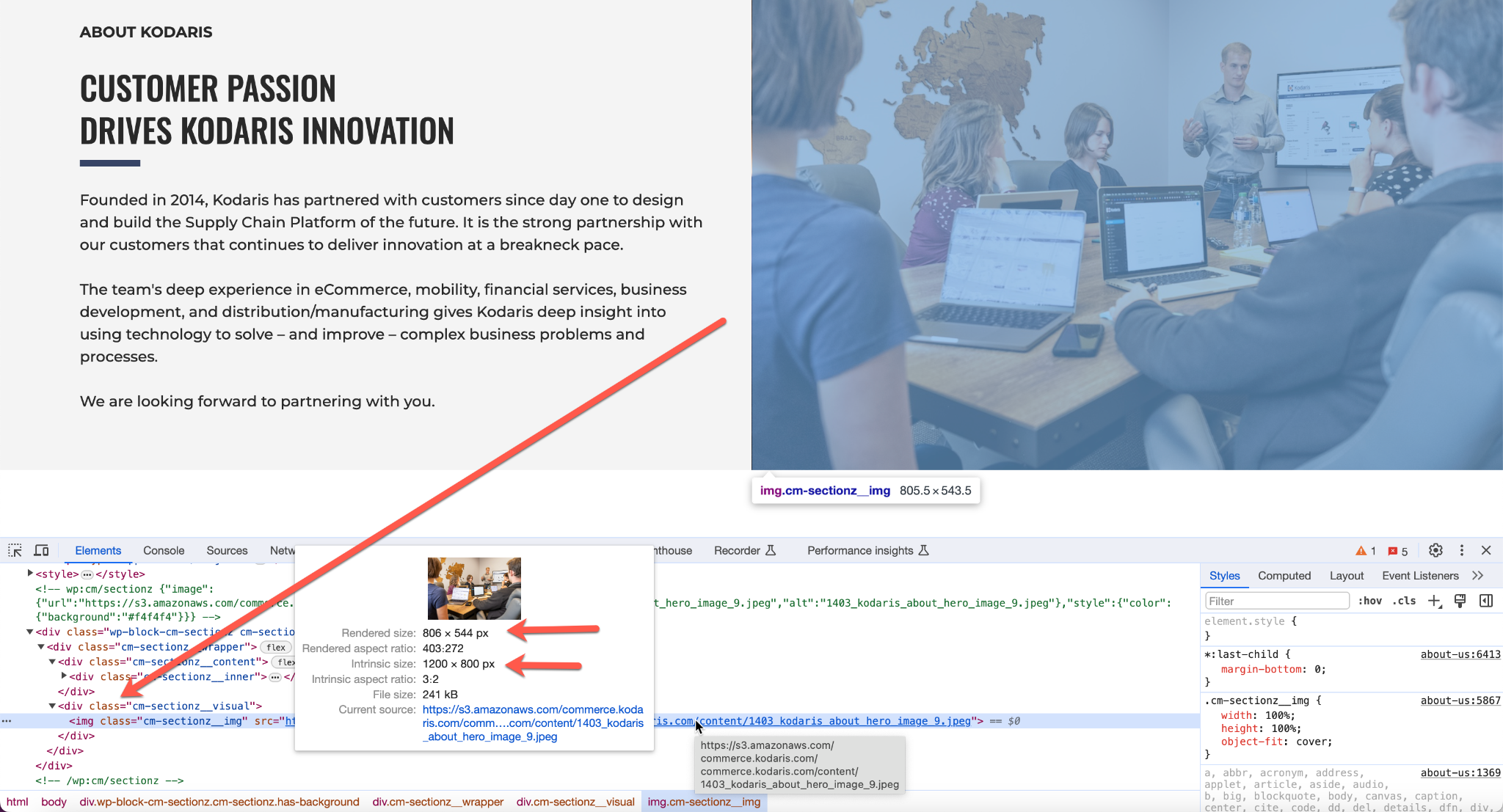
So what is the important information in the panel, and how do we use it to optimize?
Rendered size is the size that the image is being rendered/displayed within the page.
Intrinsic size is the actual size of the image being loaded into the page for display.
The best optimization for a bitmap image is where intrinsic size and rendered size meet. The closer they are, the better “optimized” your image will be. Significantly larger intrinsic size creates uselessly larger file size and negatively impacts page load speed (user experience) and SEO. Significantly smaller intrinsic size means the bitmap image is scaling up which creates poor image quality and, thus, poor user experience.
The above method can be used to narrow down ideal specs for any image within a page.
Use compressed .jpg files for photos and most full-bleed bitmap images you want to use. Compressing images in the .jpg format still provides the best combination of image quality with the smallest file size.
When optimizing your image, compress it to the point where you are still happy with the quality and yet have achieved the smallest file size.
PNGs typically are going to have a larger file size than JPG files. However, they do support the option to have transparency within the image, so PNGs are a good option for anything that requires transparency while still needing to be a bitmap-style image.
Vector images provide the best clarity for very small images like icons. Use SVG files when possible for those. Or if you have artwork that can be produced in a vector format that needs to have the option to scale from small to large within a layout, then use an SVG format or other web-friendly vector format.
While there are niche uses for other images and types, what was illustrated above should cover the majority of all use cases needed for your CMS pages.